
RISE
rebrand
Peloton started out only selling stationary bikes. Since then, they have expanded into treadmills and their name and logo no longer reflects their broader offering. From the shoe box to the knob to the posters, I used warm tones reminiscent of a sunrise. With this project I really dove into the unique needs of a major corporate rebrand and learned to use elements like the logo and color palette to make a cohesive brand.

Peloton needed a new name and logo with room to grow; that is where Rise comes in. With the logo I wanted to emulate motion but also have a small hint of a finish line banner, to circle back to the fact that people are rising to the occasion and beating goals.
When thinking about the equipment it was important to pay attention to detail, from the treadmill to the resistance knob.


From the heart monitor bag to the shoe box, I used different sunrise tones and abstracted the logo in order to achieve more movement in the branding.


For ads it was important to leverage “rise” and make them motivational in order to grab the consumer’s attention.


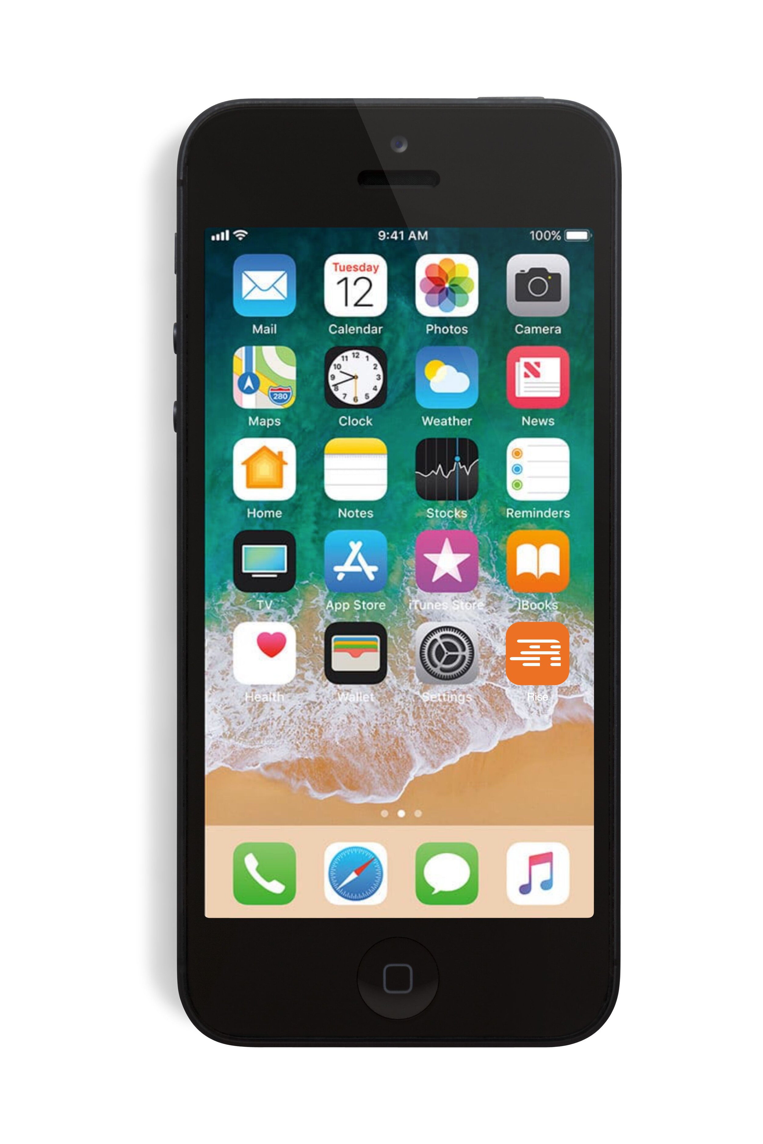
Mobile allows RISE users to go in and track their progress, explore workouts, and see upcoming classes.